Thursday, 28 November 2013

Drafts


First Draft:
This is my first draft i have added the mast head, tagline, date and price. Now I will focus on background colour maybe to change it make it more christmas themed. Also i will add cover-lines and my main image. Changes i may possibly make to what i have done now is adding snow flakes to make it more christmas themed.

My second draft i decided to add snow flakes and a plug and puff to start the contents of my magazine. I used the snowflakes to make my magazine have a christmas feel to it. Next lesson I will begin to add the contents of my front cover by adding cover lines.

This week i added cover lines and a barcode to the left hand side of my magazine following the traditional conventions of a magazine front cover. Next lesson i will be incorporating my main image.

This lesson i basically finished my magazine front cover it changed drastically from my original plan. I done this to aim better to audience and to fit the colour scheme of the colours my model is wearing. I now use a lot of bright colours such as orange and pink to appeal to the girly teenage audience i want to appeal to. My model is positioned centrally which goes against general conventions of a magazine as the model is generally placed to the right however with my image it works best being placed centrally. My model is mid laughing which is effective for my magazine as it may give the impression my magazine is fun and bubbly. Ive also added a picture of my own photography of shoes to add another picture to my front cover, i used this picture because most pop magazines aimed at girls add pictures of make up and clothing to their front cover as its what target audience like. Overall i am happy with my front cover however i will improve certain things to make it look more professional.

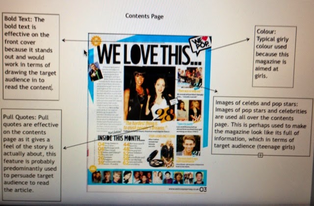
My contents page follows the general conventions of a pop magazine contents page. It follows the same colour scheme as my front cover, includes what will be in my magazine and highlights pages of importance to look at. It is not yet finished as i would like to add some photography of clothing to make it more realistic and to fill up more space to make it look packed with information and stuff teenage girls want.

My next draft of my contents page features more original images of shoes and various fashion items teenage girls would be interested in.

My final draft uses a lot of black outlining to really define certain things such as my title i chose to do this because it makes my title stand out more for the reader and audience.

My first double page spread draft includes all the content i chose to write about as well as a pink title of which i just about had time to fit in. I chose my story because it is insightful into Whitney's music and image, it would help boost her career and is the positive lighthearted story my target audience would be interested in reading about.

My second double page spread draft includes more colour and a photo accompanied by a quote. I chose to use the colours of pink and blues because they are stereotypically seen as a teenage girls favourite colour. In addition to this they are colours used through out my magazine contents and front cover. I chose to add a personal funny photo and a quote because it makes my story seem more down to earth and funny, as it comments on the average girly thing to do 'take a selfie'. This is effective because it will appeal to my target audience because they will be able to associate with this and take a chance to read over the story.


Thursday, 21 November 2013

Panning for main task

Proposal:
I am aiming my magazine specifically at teenage girls around the age of (13-17) because this is the audience of which enjoys pop music the most and who other pop magazines aim their magazines at. I will use features such as gossip and stories of male artists as these seem to be things typically used by other pop magazines to appeal to their target audience.

On the front cover i will use an image of either a happy smiling female or a picture of a good-looking boy as these are the two types of images generally used with in other front covers of pop magazines. I will go about taking it by taking a straight on medium close up from about the waste up, I won't care about the background as i will get rid of it to use a plain background or maybe a themed background.

The genre of music my magazine will be themed around is pop, this is because from my questionnaire results pop music came out to be the most populist.

My magazine will generally be about things such as concerts, winning tickets for concerts, gossip on well known popular artists, up and coming stars.

My ideas for cover lines include: Jingle Bell Ball Countdown, X-Factor Rankings, Miley Cyrus gone crazy.

I have decided on a title called 'Love Pop' i like this title because i think its quite girly and cute. Furthermore i think i can do a range of things with this title for example with the word 'Love' i would like to change the 'o' into a love heart because i think this will make my title more cute and girly and appealing to target audience.

The type of font i want to use is like serif bubble writing kind of font, as i think again it makes my magazine more suited to girls so therefor more suited to my target audience.

I will use a cheesy tagline such as something like 'Like Live Love Pop', so something that uses lots of alliteration so it is easily remembered and liked.

Mine will be published around christmas so i can use a christmas themed issue for its arrival so i have lots to talk about and so it will be popular as everyone will have money to buy it. Also i think this is a perfect time to publish it as the Jingle Bell Ball is coming soon and i can advertise the chance to win tickets of which will persuade people. Furthermore i could include weekly gifts for the countdown to christmas to persuade people to buy it as people like free stuff.

I would like to publish this magazine every week so the information is constantly up to date and so it keeps the readers interested because if i released one once a month people may loose interest for it as there are other magazines they can buy that provide unto to date information of which they want.

My magazine will be of a normal A4 size as this is generally the size of most magazines.

For the contents page i would use colours i used with on the front cover of which will be christmas themed so i will probably be using christmas themed colours on my contents page too. This is because a magazine looks more professional when colours used through out are consistent. Furthermore I will use pictures of maybe like christmas trees with in my contents page with maybe someone dressed up as an elf pretending to be some famous singer as this will add a funny side to my magazine so again will appeal to my target audience because it makes my magazine seem fun.

Lastly my magazine will be at a price of £1.50 as this is cheep so will persuade people to buy it more because it is affordable. Furthermore most teenage girls generally don't have a job so rely on pocket money from parents so this price would be definitely with in their pocket money allowance.


Initial ideas:                                                                        Flat Plan:                                              

Monday, 18 November 2013

photography analysis

 In terms of eye-line you could compare both of these front covers as the Vanity Fair one has Lady Gaga's eyes completely in the third grid whereas the Source front cover has the eye-line of the man probably one the line of the third grid. The effect of both these positioning of eye-line immediately draws the reader to it.

The positing of both main images on the magazine covers is important as the Vanity Fair cover follows general conventions of a front cover by having the image to the left, in compassion to the Source cover of which centralises their main image breaking the idea of general conventions. However this could be done for effect by having the main focal point in the middle so the reader is instantly drawn to it.

Both images seem to be taken from quite a straight on shot however the Source is more of a close up as it mainly focuses on the face to emphasise facial expression, the Vanity Fair cover has a more of a medium shot of which focuses mainly on the body perhaps done deliberately because this is a style issue so her outfit is key.

Lighting of the face is emphasised in the Source as the face of the man is the brightest part of the whole cover, again this could be done in order to emphasise the face. The Vanity Fair cover doesn't particularly use much lighting perhaps because the main focal point doesn't need to be emphasised through this technique.


Monday, 4 November 2013

Reserch of Music Magazines


This prezi is about music genres and types of magazines with in them genres


Analysis of a front cover, double page spread and a contents page:


This is an essay discussing the representation of people in my chosen genre of music magazine. My chosen genre of music magazine is pop and its target audience is young teenage girls aged around 13-15. 

Generally mise-en-scene of the main cover image and the double page spread image are that the model is generally posing in a rather ‘cutsey’ pose with a smiling, cheeky expression. As well as this they are generally dressed in really girly, fashionable clothes and props like camera’s can be used. This represents the target audience to be cute, girly and fun as well as this it also represents the musician to be like this as well. For example We Love Pop use Cher Llyod in their double page spread, she is doing a cute pose (taking a picture with a camera) this image perceives her to be cute, fun and cheeky however this is not generally the way she is in real life, its just the way the magazine wants you to see her. 

Also pop magazines aimed at the same target audience as me generally use the colour pink, which is stereotypically a girly colour. This gives the representation that the target audience are all into the colour pink and no other colour, which is obviously not true but it is seen as the most appealing colour to a teenage girl as magazines are always using the colour pink magazines such as: we Love Pop and Tops of the Pops. 

They also include, in terms of context, gossip and fashion these elements aren’t so much music related however they must appeal to target audience otherwise why would magazines include them. The fact they include gossip and fashion gives the representation that my target audience are to some degree appearance conscious and nosey into the lives of others. 

Overall pop magazines portray my target audience for my pop magazine to be vein, nosey, girly, cute and fun through a range of different ways ( colour, main images, contents).

Web-based research into target audience: 

We Love Pop: 


We Love Pop's homepage online contains nothing but gossip suggesting target audience to be interested in gossip perhaps into the lives of others especially celebrities. This could be backed up by the fact we as humans like to diverge from our to day to day lives especially into the lives of others. 

They also include linked cover lines on competitions, this shows that target audience are interested in winning things, perhaps because self consciously its known that winning something makes you feel better about yourself as well as target audience not actually being old enough to have a job, so having the chance to win something for free is very appealing.


In addition to this they mention getting your dad to 'swing' buy the shop to get you the magazine. This shows vulnerability and neediness with in my target audience, it shows that they are not quite independent enough to buy something their self. In addition to this the fact it says dad could be linked to saying 'daddy's girl' and the fact that 'daddy will buy you everything', showing that perhaps teenage girls can generally get what they want when asking 'daddy.'


Lastly the use of colour such as pink suggests that this is a popular colour of a girl, which stereotypically pink is associated with pink. However this just proves that pink is a colour that would more than likely appeal to a teenage girl otherwise why would We Love Pop use it? 


Questionnaire (for and answered by target audience):


These results shows that target audience's favourite colour is pink due to all five girls saying they liked the colour pink the most. It also shows that they are interested in gossip, celebs and fashion. In addition to this it shows that they would generally like to read about boys as 3 people spoke about boys, this proves that girls like talking about boys. Lastly it shows that all but one don't read music magazines so in order to appeal to this target audience a pop magazine such as We Love Pop needs to include gossip, boys, pink more over music in some cases to appeal to their target audience.